Behind the scenes:
Designing the Heroku playing cards
At Heroku we love and respect art and craftsmanship, in all its forms. We also believe strongly in a healthy work/life balance, paying special attention to physical activity, mindfulness, social interactions and playfulness, all of which reinvigorates our creativity and help us perform our jobs.
We created a beautiful deck of cards following these principles. This page is a description of how we went about designing the deck.
Meet the Designer

Amy Lynn Taylor
When we imagined the perfect designer for this project, we knew Amy was the one. The Heroku design team partnered with her and the team at &yet in the past, and we love how she brings thoughtful imagination to everything she does. She just gets us.
The design process
Concept
Before designing these cards, we researched everything from the history of cards, traditional card symbolism (what even is a Jack, anyway?), and the style elements used in a classic deck of playing cards.
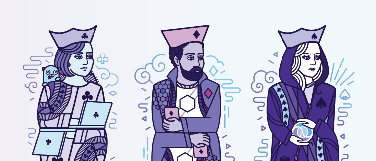
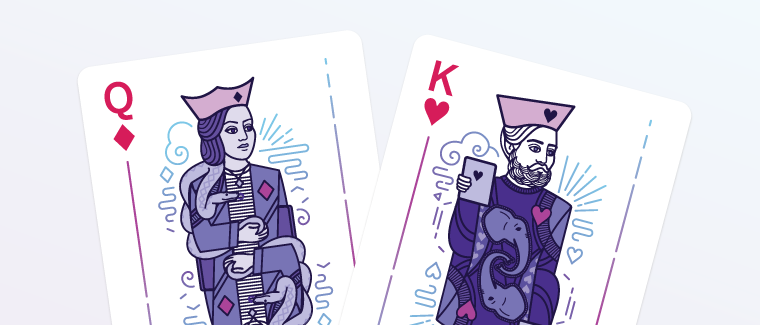
Then we started dreaming up ways to make the deck feel like our own. What could we change up about the traditional deck that might better reflect who we are and what we value? Heroku is such a developer-focused company, it only made sense that our face cards should feature developers rather than the typical medieval royalty. After all, developers are the new kingmakers.
We wanted our cards to reflect both the diversity of languages our platform supports as well as the diversity of the individuals working on it. So we set about thinking of ways we could express these ideas in the cards.

Traditional face card characters are so homogenous and boring — we wanted our characters to be unique and diverse. The hope is that anyone playing with the deck could maybe find a little of themselves in one of the characters.
Design
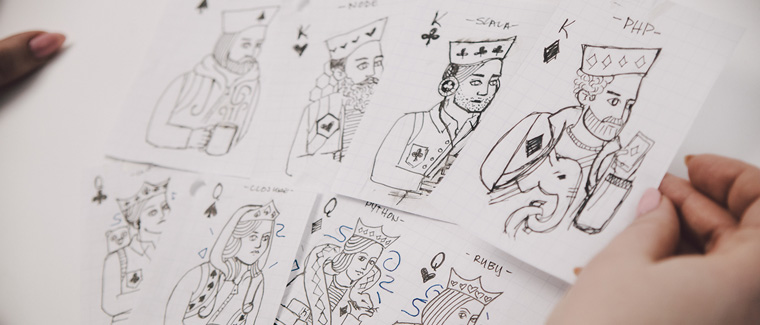
After a few rounds of brainstorming themes and sketching character concepts for our face cards, we shifted our focus to designing the overall look of the card deck itself. How could we take the concepts we’d decided on and bring them to life?

When it came time to style the cards, a lot of inspiration came from marrying the classic French-style card motifs and the existing Heroku branding which includes a lot of references to nature and tech, strong lines and a nice, cool-toned color palette.
Finishing touches
One of the things we value most is attention to detail. Well thought our details are often what takes something from good to great. This deck of cards is no exception.
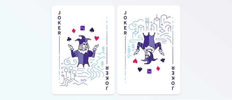
After we’d designed all the basics, we worked our way back through the deck, trying to think of details that would add visual interest or enhance the personality of the deck.

Going back and adding fun, clever little details was probably our favorite part of the project. A favorite detail on these cards? Probably the tiny club/clover in the Gopher’s mouth on the Queen of Clubs.
We care about the details
Everything we make is meticulously designed to improve the developer experience. Want to know more?
Explore the platform
